Introduction
Walk down any busy street and imagine every storefront using the same plain lettering. You’d pass by without remembering a single one. Now picture a shop with a bold, colorful symbol that instantly grabs your attention. That’s the power of a logo redesign.
A great logo isn’t just a picture, it’s identity, trust, and recognition. But even the strongest designs can feel outdated as trends evolve. To stay relevant, brands take on the challenge of logo redesign. These transformations blend creativity with strategy, ensuring the logo redesign resonates across physical stores, websites, and mobile apps.
In this blog, we’ll explore why big brands invest in logo redesigns, how simplicity and modernization fuel these updates, and showcase iconic before-and-after examples that prove design changes can redefine a brand.
Why Big Brands Invest in Logo Redesigns
The Power of Logo Redesign. A logo redesign is rarely just a cosmetic tweak. It’s a strategic decision, a calculated move by companies to keep their visual identity aligned with audience expectations. When a brand loses relevance in a competitive marketplace, the smartest choice is often to refresh.
Redesigns tie closely to modernization and digital-first platforms like apps, websites, and social media. For businesses, it’s also about expansion into new products, services, or markets, or sometimes repairing reputation and trust after controversies and major changes.
What matters most is consistency and a unified identity across both physical and digital touchpoints. Consider Dunkin’ Donuts, which became simply Dunkin’ to stay relevant, or Santander, which simplified its mark to resonate with wider audiences while preserving its heritage. Both examples show how redesigns strengthen brand recognition while signaling growth. If you’re unsure whether it’s time for a change, check out our guide on the 7 signs your brand logo needs a redesign.
The Role of Simplicity and Modernization in Logo Design
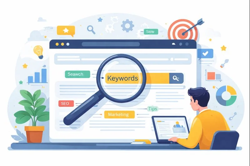
Over the past decade, branding has shifted dramatically toward simplicity. In an age of fast-scrolling feeds, logos must achieve instant recognition. Designs that carry timelessness across generations and adapt with scalability from billboards to mobile icons—win in the long run.
Modern logos share universal traits:
- Flat designs replacing glossy 3D effects
- Clean typography with sans-serif fonts
- Fewer gradients and less clutter
- Bold color palettes that adapt to screens and print
This is why Google, Spotify, and Mastercard stripped down their look to be bolder, flatter, and more versatile. These adjustments not only refreshed the aesthetic but also optimized brand performance across digital-first environments.
Case Studies: Iconic Logo Redesigns That Inspire
Google Logo Redesign
- Before: A playful serif font with multiple colors.
- After: A streamlined sans-serif typeface, modern and digital-ready.
- Impact: Made Google feel more approachable, innovative, and adaptable across platforms.
YouTube Logo Redesign
- Before: A bulky red box around the “Tube.”
- After: A clean wordmark with the play button as its central icon.
- Impact: Simplified for mobile and video-first users, making the logo instantly versatile.
Uber Logo Redesign
- Before: Confusing iterations with abstract symbols.
- After: A minimal wordmark with clear typography.
- Impact: Build global consistency and trust in a competitive transportation market.
Starbucks Logo Evolution
- Before: A detailed mermaid with text.
- After: A simplified siren with no brand name.
- Impact: Became recognizable worldwide, proving a logo can stand strong even without text.
Dunkin’ Logo Redesign
- Before: “Dunkin’ Donuts” with coffee cup imagery.
- After: Just “Dunkin’” in bold orange and pink.
- Impact: A modernized identity signaling growth into beverages and snacks while maintaining its playful spirit.
Conclusion & Key Takeaways
A logo redesign is more than aesthetics; it’s storytelling and connection. In my work, I’ve seen how a good redesign modernizes identity, enhances recognition, and ensures scalability across touchpoints. Beyond design, it sends a message: a brand is willing to evolve, adapt, and listen to its audience.
Iconic brands like Google, Starbucks, and Dunkin’ prove that logos evolve with time. The best logos achieve balance honoring heritage while embracing innovation. Done right, a redesign makes customers feel the brand is both trustworthy and forward-thinking. For businesses, this balance of creativity and strategy is what transforms a logo from just a mark into a powerful symbol of progress.
FAQs
Q1. Why do companies redesign their logos?
To stay relevant, modernize, expand into new markets, and maintain consistency across digital platforms.
Q2. What makes a logo redesign successful?
Simplicity, adaptability, and balancing heritage with modernity.
Q3. How often should a business refresh its logo?
Most successful companies update every 7–10 years or when hitting new phases of growth.
Q4. Do redesigns always work?
Not always redesigns fail if they alienate audiences. The secret is evolution, not revolution.
Q5. How can small businesses approach logo redesigns on a budget?
Smaller brands don’t always need an expensive overhaul. By simplifying design, focusing on clarity, and ensuring scalability for digital platforms, even a modest redesign can make a brand feel refreshed and professional.